Welcome to the GoFuckYourself.com - Adult Webmaster Forum forums.

You are currently viewing our boards as a guest which gives you limited access to view most discussions and access our other features. By joining our free community you will have access to post topics, communicate privately with other members (PM), respond to polls, upload content and access many other special features. Registration is fast, simple and absolutely free so please, join our community today!

If you have any problems with the registration process or your account login, please contact us.

Post New Thread Reply

Register GFY Rules Calendar
Go Back   GoFuckYourself.com - Adult Webmaster Forum > >
Discuss what's fucking going on, and which programs are best and worst. One-time "program" announcements from "established" webmasters are allowed.

 
Thread Tools
Old 10-21-2011, 11:03 AM   #1
blackmonsters
Making PHP work
 
blackmonsters's Avatar
 
Industry Role:
Join Date: Nov 2002
Location: 🌎🌅🌈🌇
Posts: 20,021
Critique my NEW Flv player Skin Please.

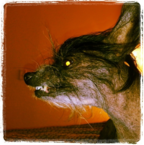
I just finished a new skin for my flv player and need more feedback.

The previous feedback was very helpful.

I think this skin may be a good one.

Let me know.

http://slomoplayer.com/
__________________
Camsoda pays :
Become a Cam Model or Sign up as a Webmaster
blackmonsters is offline   Share thread on Digg Share thread on Twitter Share thread on Reddit Share thread on Facebook Reply With Quote
Old 10-21-2011, 11:45 AM   #2
V_RocKs
Damn Right I Kiss Ass!
 
Industry Role:
Join Date: Dec 2003
Location: Cowtown, USA
Posts: 32,308
Don't really like how "slick" it is... Good for a bistro or something richie-rich... But on this site it should be more NHRA looking. Blocky...
V_RocKs is offline   Share thread on Digg Share thread on Twitter Share thread on Reddit Share thread on Facebook Reply With Quote
Old 10-21-2011, 12:26 PM   #3
KickAssJesse
Confirmed User
 
KickAssJesse's Avatar
 
Industry Role:
Join Date: Jul 2008
Location: Los Angeles
Posts: 942
1) The edges on some of the graphics are jagged; perhaps use flash vector shapes to repair this?

2) Light sources on graphics are inconsistent, or at least appear to be.

3) The drop shadow/outer black glow around the player doesn't really work for me; maybe it's a off/on feature?

4) Player "play button" is inconsistent to your controller design, and it's also jagged.

Overall, it's a pretty decent looking player
__________________

Contact - email: jesse~AT~atkcash~DOT~com - Skype: kickassjesse - ICQ: 386185547
ATK Cash $$$
KickAssJesse is offline   Share thread on Digg Share thread on Twitter Share thread on Reddit Share thread on Facebook Reply With Quote
Old 10-21-2011, 12:28 PM   #4
Highest Def
In the Cave of Gold
 
Highest Def's Avatar
 
Industry Role:
Join Date: Jun 2010
Location: ONLINE
Posts: 660
I've seen your last couple attempts and the design on your sites and you have a REAL problem with gradients. This is the best advice I was ever given about design and I hope to hell you take it. Gradients are NOT meant to be so drastic. It is supposed to be a VERY subtle effect. They look absolutely horrible and 'hey look, i just got photoshop' amateur hour when done the way you are doing them.

Also, your buttons or icons on the player are just too stretched out. They look cheesy. I made a little graphic that I think illustrates my point.

__________________
Highest Def is offline   Share thread on Digg Share thread on Twitter Share thread on Reddit Share thread on Facebook Reply With Quote
Old 10-21-2011, 12:32 PM   #5
SmokeyTheBear
►SouthOfHeaven
 
SmokeyTheBear's Avatar
 
Join Date: Jun 2004
Location: PlanetEarth MyBoardRank: GerbilMaster My-Penis-Size: extralarge MyWeapon: Computer
Posts: 28,609
the buttons look squished , it is an ok player , alot of competition in video players
__________________
hatisblack at yahoo.com
SmokeyTheBear is offline   Share thread on Digg Share thread on Twitter Share thread on Reddit Share thread on Facebook Reply With Quote
Old 10-21-2011, 12:34 PM   #6
candyflip
Carpe Visio
 
candyflip's Avatar
 
Industry Role:
Join Date: Jul 2002
Location: New York
Posts: 43,030
I hate gradients. You use them way too much and not in a way that is at all attractive.
__________________

Spend you some brain.
Email Me
candyflip is offline   Share thread on Digg Share thread on Twitter Share thread on Reddit Share thread on Facebook Reply With Quote
Old 10-21-2011, 12:34 PM   #7
Barry-xlovecam
It's 42
 
Industry Role:
Join Date: Jun 2010
Location: Global
Posts: 18,083
Might look better with less shadow effect.
The loop button should be more like the slow button (size -- readability).

Overall it looks pretty good.
Barry-xlovecam is offline   Share thread on Digg Share thread on Twitter Share thread on Reddit Share thread on Facebook Reply With Quote
Old 10-21-2011, 12:40 PM   #8
blackmonsters
Making PHP work
 
blackmonsters's Avatar
 
Industry Role:
Join Date: Nov 2002
Location: 🌎🌅🌈🌇
Posts: 20,021
Quote:
Originally Posted by Highest Def View Post
I've seen your last couple attempts and the design on your sites and you have a REAL problem with gradients. This is the best advice I was ever given about design and I hope to hell you take it. Gradients are NOT meant to be so drastic. It is supposed to be a VERY subtle effect. They look absolutely horrible and 'hey look, i just got photoshop' amateur hour when done the way you are doing them.

Also, your buttons or icons on the player are just too stretched out. They look cheesy. I made a little graphic that I think illustrates my point.

I can't help myself with gradients, I start out making them subtle and then, well....

The buttons stretch because the original player size was 320x240 and I made it
bigger without making all the buttons bigger.

I'll try to change that in the next skin.
__________________
Camsoda pays :
Become a Cam Model or Sign up as a Webmaster
blackmonsters is offline   Share thread on Digg Share thread on Twitter Share thread on Reddit Share thread on Facebook Reply With Quote
Old 10-21-2011, 12:46 PM   #9
blackmonsters
Making PHP work
 
blackmonsters's Avatar
 
Industry Role:
Join Date: Nov 2002
Location: 🌎🌅🌈🌇
Posts: 20,021
Quote:
Originally Posted by KickAssJesse View Post
1) The edges on some of the graphics are jagged; perhaps use flash vector shapes to repair this?

2) Light sources on graphics are inconsistent, or at least appear to be.

3) The drop shadow/outer black glow around the player doesn't really work for me; maybe it's a off/on feature?

4) Player "play button" is inconsistent to your controller design, and it's also jagged.

Overall, it's a pretty decent looking player

The drop shadow is just a background jpeg.
Could be better for sure.

Yeah, I'm seeing the jagged edges on the play buttons. Very slight, but can be seen.
__________________
Camsoda pays :
Become a Cam Model or Sign up as a Webmaster
blackmonsters is offline   Share thread on Digg Share thread on Twitter Share thread on Reddit Share thread on Facebook Reply With Quote
Old 10-21-2011, 12:50 PM   #10
blackmonsters
Making PHP work
 
blackmonsters's Avatar
 
Industry Role:
Join Date: Nov 2002
Location: 🌎🌅🌈🌇
Posts: 20,021
Quote:
Originally Posted by Barry-xlovecam View Post
Might look better with less shadow effect.
The loop button should be more like the slow button (size -- readability).

Overall it looks pretty good.
I'm having a hard time with that loop button because I want to make it round like
a loop and the text is for some reason a hard word to make look good.

It might look better if I simply go in and make all the buttons the right size for this
player. I made the player stage larger but kept buttons the same size and resized
with action script.
__________________
Camsoda pays :
Become a Cam Model or Sign up as a Webmaster
blackmonsters is offline   Share thread on Digg Share thread on Twitter Share thread on Reddit Share thread on Facebook Reply With Quote
Post New Thread Reply
Go Back   GoFuckYourself.com - Adult Webmaster Forum > >

Bookmarks


Advertising inquiries - marketing at gfy dot com

Contact Admin - Advertise - GFY Rules - Top

©2000-, AI Media Network Inc


Powered by vBulletin
Copyright © 2000- Jelsoft Enterprises Limited.